Ashley Cheuk

Product Designer

Incorrect password — try again.

Asia Miles app — hero

In compliance with the NDA, data has been modified and partial information has been left out.

Cathay Pacific · Airline · Loyalty

Driving engagement beyond flights by revamping Cathay's Asia Miles app

Role
Product Designer & Researcher
Year
May – Dec 2024
Platform
iOS & Android

Cathay Pacific's Asia Miles app was underperforming on a key business goal: getting members to earn and spend miles on dining, shopping, and lifestyle—not just travel. Engagement with non-flight activities was low, and the App Store sat at 2.0★.

The constraint: Business and engineering ruled out building a personalization infrastructure. Anything I designed had to work within existing systems.

Our hypothesis: Cathay's propositions weren't the problem. It was when and where we surfaced them.

My role: 1 of 2 Product Designers, working with one PM and four engineers. I facilitated user interviews, defined the IA restructure, and drove design through to implementation.

Design outcome

▲ Up Traffic contribution to Cathay's online store Target exceeded
▲ Up Engagement on non-flight propositions Target exceeded
▲ Up +35% New app users in the first month post-launch Target exceeded
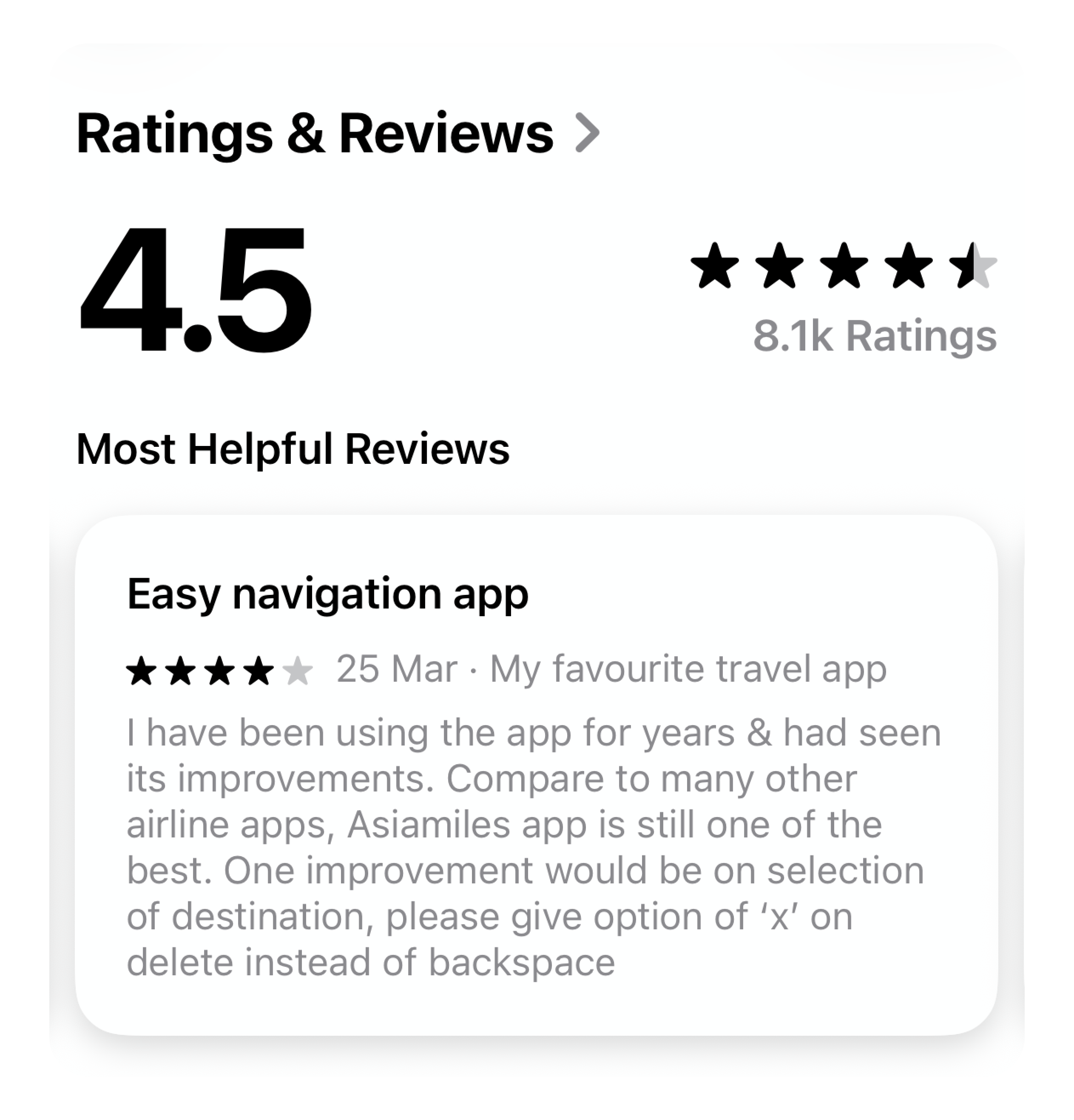
▲ Up 2.0 → 4.5★ iOS App Store rating Target met
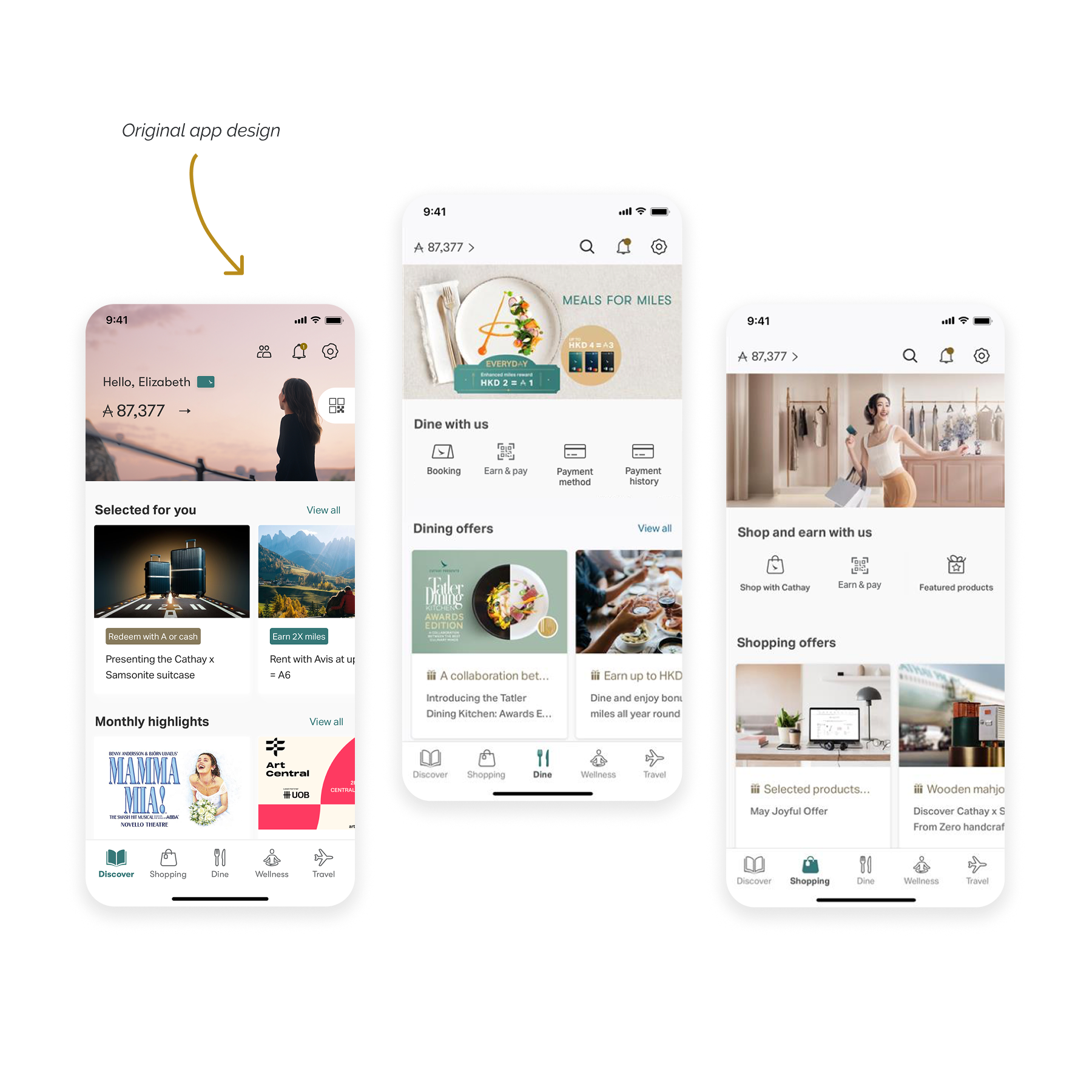
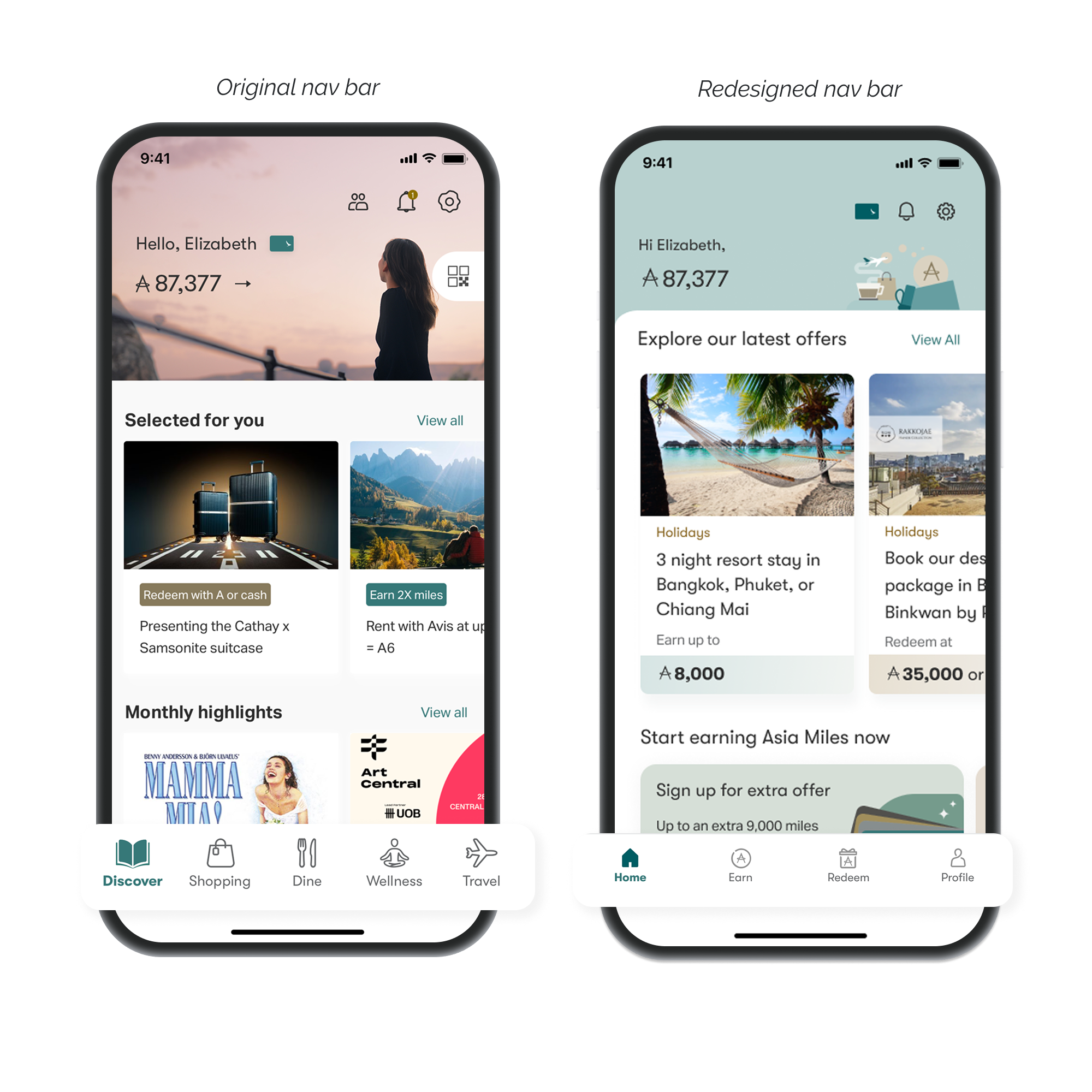
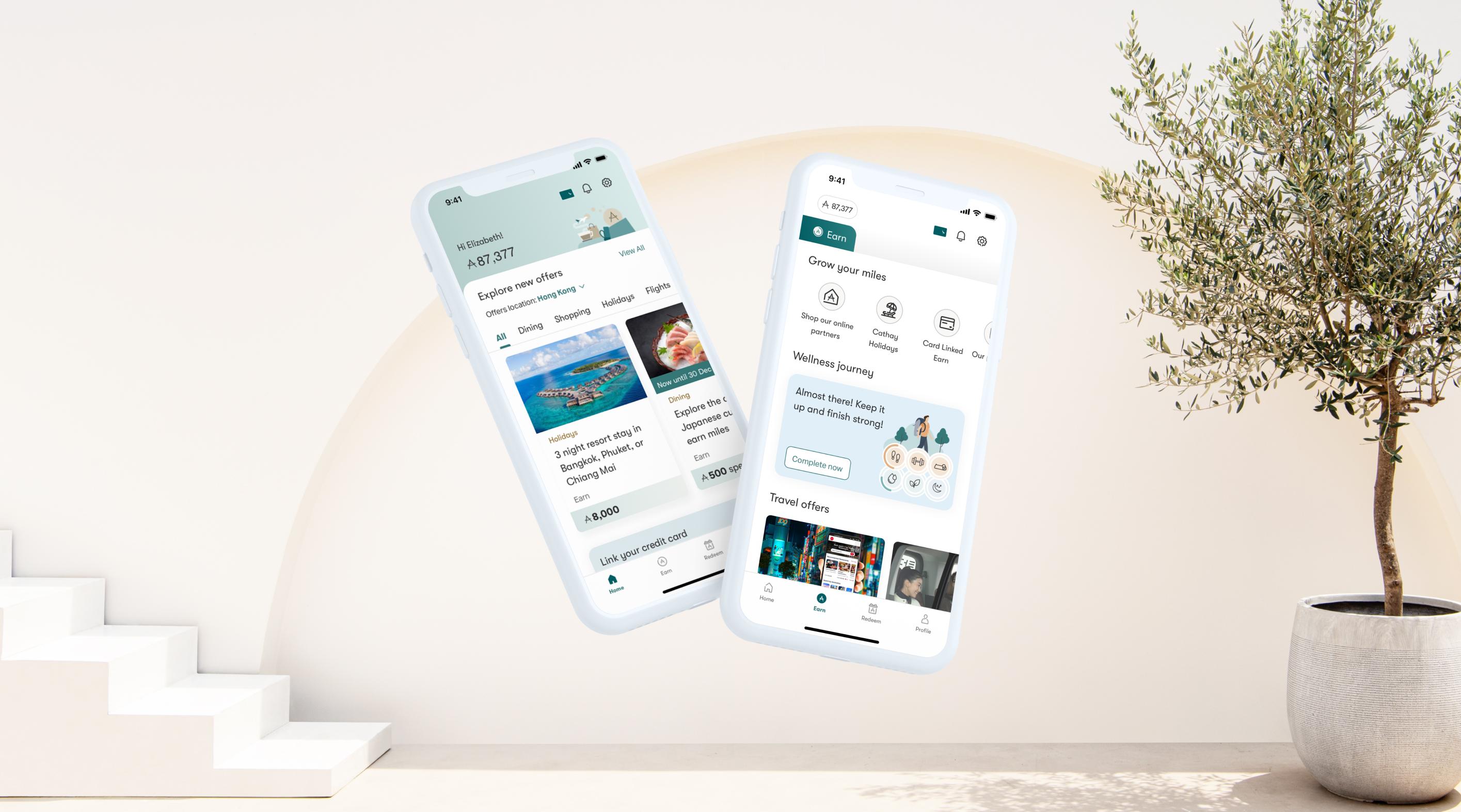
Complete information architecture revamp

Refined the entire app's navigation and visual hierarchy based on user goals uncovered via user interviews.

Introduced Nearby Partners

Members can now see dining and shopping partners that are within walking distance from their current location

Introduced content prioritization logic

Utilized existing data: location, member tier, and miles balance to create personalization all within constraints

The original app was organized by categories: dining, shopping, travel, however users' goals and interests differed according to member tiers

Original app design

Interview takeaways

User goals
  • Lower tiers opened the app to find ways to earn miles however they could.
  • Higher tiers opened it to spend miles they'd accumulated faster than they could use.
User interest
  • Lower tiers searched for the easiest earning opportunities no matter the amount.
  • Higher tiers valued redeeming exclusive offers, and only participated in earning miles if rewards were large.

Restructured the app around user goals, not offer categories

Through rounds of card sorting interviews, we reorganized the app navigation around Earn vs Redeem to align with both high and low member tiers. The content logic was also refined based on tier based relevance.

Navigation refinement

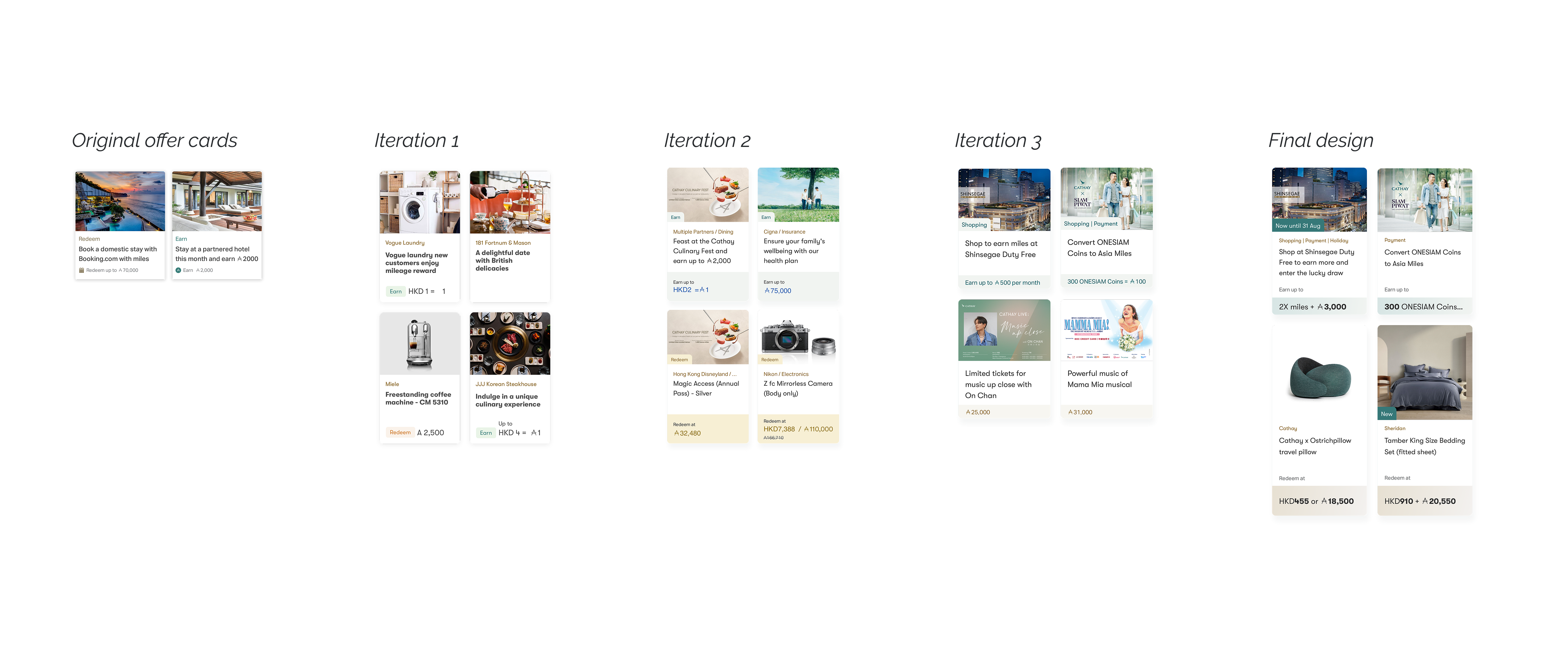
Offer card design

In collaboration with other product teams, I refined the offer card into a shareable component that could be used across teams with various use cases.

We also introduced semantic colours to visually differentiate Earn vs Redeem offers. Jade green was ideal for 'Earn', while gold aligned with 'Redeem'.

Offer card design

More can be done

Clicks across the bottom navigation increased, but CTR on individual offers remained low. We still weren't matching offers with target members.

Introduced rule-based personalization

This was the core design challenge: how do you make content feel personally relevant when you can't build a recommendation engine? After ideating with PMs and designers, I designed two new features leveraging existing logic:

Nearby partners

Research showed members were more likely to visit partners within walking distance. We introduced a "nearby" layer.

Miles balance

Members were shown redemption options matched to what they could actually afford.

▲ Up Traffic contribution to Cathay's online store Target exceeded
▲ Up Engagement on non-flight propositions Target exceeded

Raising the App Store rating organically

Our PM was hoping to boost our App Store ratings and proposed a gated rating prompt — we ask users if they're enjoying the app, and only if they're satisfied they would be routed to the App Store. I flagged this as it inflates the score while filtering out the signal we need to improve.

I proposed an alternative: trigger App Store feedback after a genuine valuable moment. For example, after registering for a campaign, or checking miles credit.

Result: Over three months, iOS ratings rose organically from 2.0 to 4.5★.

App Store review
App Store rating